English
For my English portion, I researched different approaches and methods to a Montessori school and developed a syllabus that was appropriate for a 2nd grade classroom. I focused my time in the hopes of creating a space that puts an emphasis and new found appreciation on “doing school differently.” With my research, I took a closer look into the actual process it takes into creating a syllabus and what requirements are necessary for elementary school teachers to follow so they can meet all standards for second graders. I also paid close attention to detail as to what additives could contribute to the childrens well being and make them more prone to focusing on their education in a positive manner. Overall, the final product that was created was a syllabus in the perspective of I, as the teacher. Within this, I implemented new standards to increase the productivity and creativity for our childrens education system.
Self in the Modern World
For the history portion, my main focus was to create the actual school that was implementing the new found standards for the elementary students. Most of my research pertained to other schools that had a more private school and Montessori based structure, and I used that information to influence how I built my own school. The schools I specifically took a look at were “The City in School” and a private school in Philadelphia. With all the information that I collected, I transformed my idea into a website that provided all the information for parents to look at so they can get a feel as to what we are providing for their children. The main reason as to what benefits they have is all listed in the “Why?” section of the website. Otherwise, the entire website gives a run down of our ethics, morals and daily routines that would help structure the children.
Art
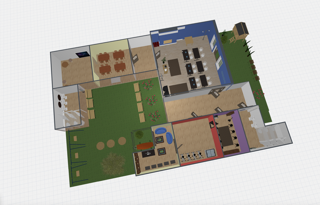
As a part of my website, I made a blueprint design of what I wanted my school to look like on a smaller scale. Throughout this process, I researched the general logistics as to what should go into a building and how a typical school is built like. I also color coordinated the rooms based on the office space productivity that it stimulates. For example, The main class room is blue to help promote a calming environment and the music room is purple for a more musical atmosphere. More in depth descriptions will be listed below! Overall, the final product presented was a digital version of the school that I was describing in the website and I combined all aspects of traditional and Montessori schooling to help with the mental and emotional growth of the future second graders.
reasoning behind the color choices...
Blue : Promotion of calm and productive stimulus so that is the reason for it in the main classroom. This way the color will promote productivity since this is the area where most of their work will be done.
Red : Red is mainly known as the physical color most associated with the body. It increases your heart rate, blood flow, and appetite. That is the reason why I decided to paint the gym’s colors seeing as the physical activity would be targeted and focused on in this certain area.
Yellow : Yellow is a feel-good color used as a powerful accent color when highly intensive or soothing. Since it's very much associated with soothing part of our brain, I thought it was only appropriate to put that in the cafeteria and library because as bias as it may be, reading is a very calming activity and the cafeteria is an area where most kids get to let loose after a long day in school.
Purple : This color promotes the idea of musical intelligence hence why it was placed in the music room. Speaking logically, this is the only classroom that is associated with music so it was only fitting to put the color that helps with musical intelligence in the musical classroom.
Green : The color green helps improve the stimulus of creativity and this is the main reason we focused a lot of greenery in our garden area. As ironic as it is, the garden is the most plentiful with greens but aside from the fact that it is all plants, I designed it so the other tools and equipment are also very much green looking or have a similar tone.
